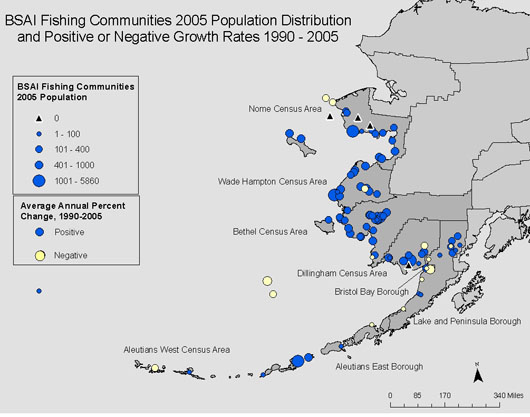
This is a statistical map of coal production in the Donn Basin in 1921. The number of carts represents the amount of coal produced.

 This parallel coordinate graph shows how different new car models score on various attributes attributes such as price, horsepower, weight, etc.
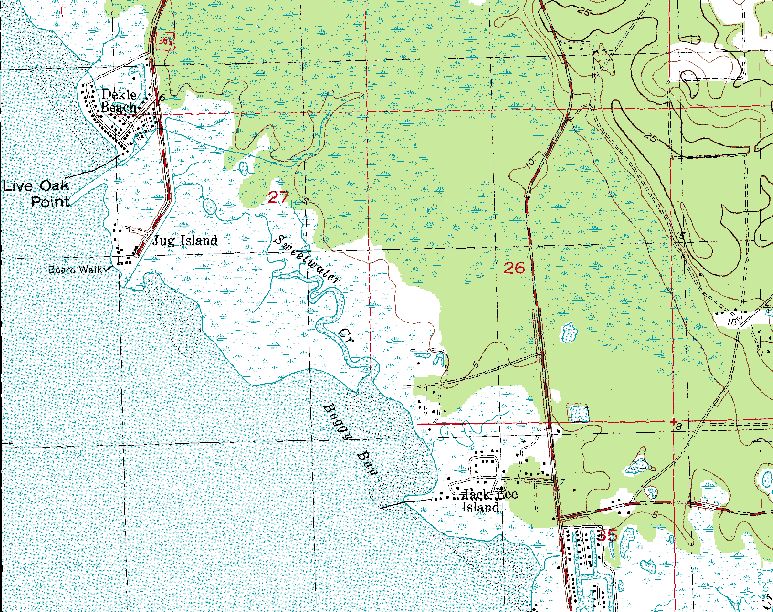
 This digital line graphic was produced by USGS and is of Georgia. This particular maps shows both natural and built features.
  This is sonar imagery laid over isopach contours of sediment thickness. The isopach contour lines were derived using seismic interpretations.




 This is a map of different land coverage in New Hampshire. The colors have no numeric value and the types of coverage have no hierarchical order.
 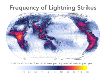 This map shows frequency of lightening strikes per square mile. It is unclassified by any specific range but instead is showed using a continuous color scale that changes with every strike.
 This map shows population distribution of Florida in 2000. The data is standardized by density per square mile.
 This is a map looking at the quality of health care for various countries. It is technically a multivariate map because it shows data for a particular\ geographical area and is classified by multiple phenomenon at one time. In this case Heath care spending per capita, rank of quality of health care, life expectancy, and infant mortality. http://http://www.moneyweek.com/news-and-charts/economics/healthcare-reform-is-the-nhs-a-socialist-nightmare-44907.aspx