
This is a statistical map of coal production in the Donn Basin in 1921. The number of carts represents the amount of coal produced.

 This parallel coordinate graph shows how different new car models score on various attributes attributes such as price, horsepower, weight, etc.
 This is sonar imagery laid over isopach contours of sediment thickness. The isopach contour lines were derived using seismic interpretations.


 This is a map of different land coverage in New Hampshire. The colors have no numeric value and the types of coverage have no hierarchical order.
 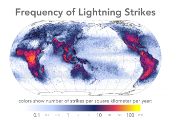 This map shows frequency of lightening strikes per square mile. It is unclassified by any specific range but instead is showed using a continuous color scale that changes with every strike.
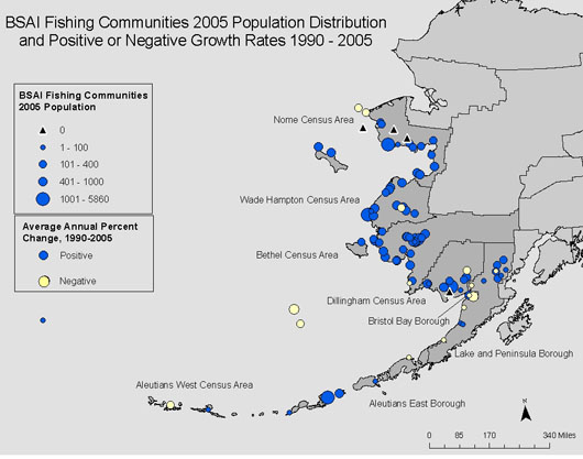
 This map shows population distribution of Florida in 2000. The data is standardized by density per square mile.
 This is a map looking at the quality of health care for various countries. It is technically a multivariate map because it shows data for a particular\ geographical area and is classified by multiple phenomenon at one time. In this case Heath care spending per capita, rank of quality of health care, life expectancy, and infant mortality. http://http://www.moneyweek.com/news-and-charts/economics/healthcare-reform-is-the-nhs-a-socialist-nightmare-44907.aspx
 The following correlation matrix shows the correlation between the cluster moments for electrons and pions to try and find optimal pairs.
  This statistical graph is of foreign students in US schools. From the graph you can see that the biggest percentage of exchange students in the US are from Asia and that Oceanian students hold the smallest percent.
  These are LIDAR images of Mt. St Helen, WA. from 2003 to 2004. You are able to see the build up of snow through the year ultimately causing a avalanche. The images are taken by shooting light rays from an airplane and recording the data.
  This is a climograph showing the correlation of between participation and temperature averages in San Francisco, CA. You can see the temperatures drop as precipitation rises.
 http://www.baihp.org/casestud/hdh_roof/images/energy_scatter.gif
 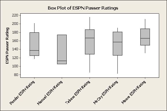 This is a box plot made of football player ESPN passer ratings. With a maximum rating of 200 and a minimum of 80, the most consistent of the players seem to be Tebow and McCoy. While McCoy's max rating isn't as high both of their medians fall within their inter quartile range.
 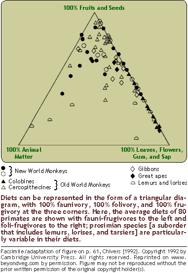 While the image gives a pretty good description of what this plot represents a generalization can be made in terms of these primates sampled not having much meat matter in their diets. If I were to plot myself here I would probably be more to the left about half way up.
 .JPG) This is a histogram that represents the recorded hourly wind speeds at Plymouth Mountbatten. A histogram is appropriate for this representation because they are only interested in one element and that is wind. The graph shows that as the average hourly wind speed of "u" increases the number of occurrences decreases.
This is a histogram that represents the recorded hourly wind speeds at Plymouth Mountbatten. A histogram is appropriate for this representation because they are only interested in one element and that is wind. The graph shows that as the average hourly wind speed of "u" increases the number of occurrences decreases.  This stem and leaf plot is sample data of a single healthcare provider on the amount of money women paid for a single mammogram. The sample size was 221 as shown by the blue numbers on the right but also by counting the red squares. Each square is worth up to 3 individuals, according to the article. The mean for the procedure was $546 and the median and mode were both $703.
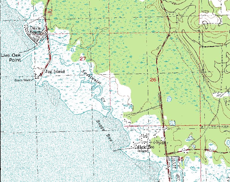
 This is a black and white aerial photo of Wakulla Florida. Its clear from the photo where development is. The two rivers standout very well in black in white along with the other water sources.

 different parking ots and transit venues.


 This is a map of townships in Oneida County, Wisconsin. You can see the around the border of the map the "T" township number "N" North and also the "R" Rang number East that corresponds to each of the squares. Also with in each individual square you can see the page number of where the PLSS description can be found on that township. The description also points out the difference between a township and a town and points to teh Town of Minocqua and its 5 townships within it as an example.
 This is a really cool cadastral map created by Laura Chapman from FSU. She used esri's ArcGIS and with data from the property appraisers site created this really neat Existing Land Use Map. Each of the parcels when clicked on provide the owners name, size, value, and more. She said she vibrant colors of Van Gogh and other artist to give the map a fine art quality, which I really liked.
 This a thematic map of Florida using census data form 2002 that shows the value of retail sales per capita. It is clear from the map that most of the counties with the highest value in sales for their population are those located either on the coast or with heavy amounts of agriculture.
 An Infrared aerial map of the deep water river channel of the Sacramento River. This allows them to monitor levees or any vegitation that may be blocking the channel.

 This is a street map to the Shakespeare Theater in Washington, DC. There is no relief in the map, only street names and landmarks.


.JPG&imgrefurl=http://www.wind-power-program.com/wind_statistics.htm&usg=__DurPt9GgaMX88RM42rXT7tWZ6CA%3D&h=411&w=600&sz=45&hl=en&start=77&sig2=xz63AEWfAHBkqv-Lt1mZqg&um=1&itbs=1&tbnid=L1ZI_qeRCtXL7M:&tbnh=92&tbnw=135&prev=/images?q%3Dhistogram%26start%3D60%26um%3D1%26hl%3Den%26client%3Dsafari%26sa%3DN%26rls%3Den%26ndsp%3D20%26tbs%3Disch:1&ei=tJ07TNmnJcL48Aa0hpioBg)